Printscene — Somercotes, Alfreton, Derbyshire
Print-Ready Artwork: What to Send Your Printer
Getting your artwork right before it goes to print saves time, money, and frustration. Most common print problems — fuzzy text, colours that shift, content cropped at the edge — come back to artwork that wasn’t set up correctly at the start. This guide explains what print-ready artwork actually means and what to check before you send your files.
Written by Printscene
- Print artwork
- File setup
- Print ready
- Derbyshire
What does “print ready” actually mean?
Print-ready artwork is a file that contains everything a printer needs to produce your job accurately — correct dimensions, correct resolution, correct colour mode, and with any bleed included where needed. When all of those things are in order, the printer can go straight to production without needing to go back to you to fix something first.
The alternative is supplying artwork that needs amending before it can be used — which takes time, can cause delays, and sometimes results in artwork being adjusted without the customer seeing the change first. Getting it right from the start avoids all of that.
File formats: what works and what to avoid
PDF (recommended for most print)
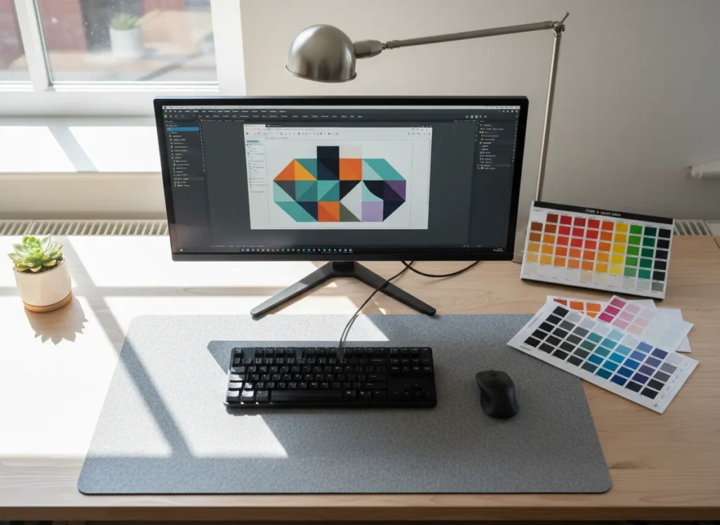
A properly exported PDF is the most reliable format to send to a printer. When exported at the correct settings — print quality, with fonts embedded, and in the right colour mode — a PDF accurately preserves what you’ve designed. Most professional design software can export a print-ready PDF.
The key is to export at print quality, not screen quality. A PDF saved at 72dpi for web use is not the same as one saved at 300dpi for print.
AI and EPS (Adobe Illustrator / vector formats)
Vector formats are ideal for logos, signs, and any artwork that needs to scale without quality loss. A vector image is built from mathematical paths rather than pixels, which means it can be reproduced at any size — from a business card to a building wrap — without losing sharpness.
If your logo was professionally designed, you should have a vector file (AI or EPS). Hold onto it — it will be useful any time you need a sign, large format print, or embroidered garment produced.
TIFF and high-resolution PNG
Bitmap (pixel-based) files work for print when the resolution is high enough. TIFF is the preferred format for high-quality print images. PNG works well for logos with transparency. Both need to be saved at 300dpi at the actual print size — not scaled up from a smaller file.
JPEG
JPEGs can work for photographic content if the image is high resolution. The issue with JPEGs is that the file format uses compression, which can soften fine detail. For most print purposes a JPEG that’s genuinely 300dpi at print size will be fine. Where a JPEG causes problems is when it’s been saved at low quality or repeatedly re-saved, which compounds the compression artefacts.
What to avoid
Resolution: why 300dpi matters
DPI stands for dots per inch — it describes how much detail is packed into a printed image. The higher the dpi, the sharper the output. For standard print (leaflets, business cards, compliment slips, stationery), 300dpi at actual print size is the accepted standard.
The catch people often miss is that dpi is meaningless without the actual print dimensions. An image that’s 300dpi at 10cm wide becomes 150dpi if you double it to 20cm wide. The resolution drops as the image is scaled up.
The rule of thumb: Supply your image at the actual size it will be printed, at 300dpi. Don’t supply a small image and ask for it to be scaled up — the resolution won’t be there and the output won’t be sharp.
For large format print — banners, signs, vehicle graphics — the resolution requirement is different. Because large format output is usually viewed from further away, 100 to 150dpi at print size is often sufficient. Your printer will confirm the right specification for the specific job.
Colour mode: CMYK vs RGB
This is one of the most common causes of colour shifts between what a designer sees on screen and what comes out of the printer.
RGB (Red, Green, Blue)
RGB is the colour mode used by screens — monitors, phones, and digital displays. It can produce very vivid, bright colours because screens emit light. When you design on screen and leave artwork in RGB, the colours can look striking — but they may not reproduce accurately in print.
CMYK (Cyan, Magenta, Yellow, Black)
CMYK is the colour mode used for most commercial printing. Printers mix these four inks to reproduce colour. The CMYK colour gamut is smaller than RGB, which means some vivid screen colours — particularly electric blues and bright greens — can’t be exactly reproduced in CMYK ink and will print slightly differently.
Converting artwork to CMYK before sending it to print means you see the adjusted colours at the design stage, before anything is committed to print. Converting after the fact can sometimes produce unexpected shifts if the original design used colours outside the CMYK range.
For print: use CMYK
Set your document colour mode to CMYK in your design software before you start. This way what you see on screen is a closer match to what will print.
Brand colours and Pantone
If your brand uses specific Pantone (PMS) colours, supply those references to your printer. For jobs where colour accuracy is critical, ask about spot colour or Pantone-matched printing options.
Bleed and safe area
If your design has colour, images, or graphics that run right to the edge of the finished piece — what’s called a “full bleed” design — then your artwork needs to include a bleed area.
What is bleed?
When a printer produces a run of flyers or business cards, they print onto larger sheets and then cut them down to size. Cutting is precise but not perfect to the millimetre — there’s a small tolerance. If your background colour or image stops exactly at the finished edge of your design, even a tiny shift in the cut position will leave a white sliver along one or more edges.
Bleed is the extra area you add around your design — typically 3mm on each side for standard print — that extends your background or edge graphics beyond the trim line. When the sheet is cut, any variation in the cut position still hits the bleed area rather than the white of the unprinted sheet.
What is the safe area?
The safe area is the zone inside the trim line where all important content — text, logos, contact details — should sit. The standard guidance is to keep key content at least 3mm inside the trim edge. This ensures that even if the cut is very slightly off, your critical content remains fully visible.
In summary: Background and edge graphics extend 3mm beyond the trim line (bleed). Important text and logos sit at least 3mm inside the trim line (safe area). Your printer will confirm the exact bleed requirement for each product.
Fonts and text
Embed your fonts
If you’re supplying a PDF, make sure fonts are embedded. An unembedded font means the printer’s system tries to substitute a similar font — which can shift text spacing, cause layout breaks, or produce unexpected results. Most design software embeds fonts automatically when you export to PDF at print settings, but it’s worth confirming.
Convert text to outlines
An alternative to embedding fonts — and often the safer option — is to convert all text to outlines (sometimes called paths) before saving your final file. This converts each letter from live editable text into a fixed vector shape. Font substitution becomes impossible because there’s no longer a font to substitute. The trade-off is that the text is no longer editable, so always keep a working copy of your file before converting.
Minimum text size for print
Very small text can become difficult to read in print, particularly with fine serif typefaces. As a rough guide, 6pt is typically the smallest text that remains legible in standard commercial print. Reversed text (white or light text on a dark background) should usually be a little larger to maintain clarity.
A practical checklist before sending artwork
What if I don’t have print-ready artwork?
Not everyone has design software or a designer available. If you have a rough idea of what you want but not a finished file, we can help. We produce artwork for many of our customers — from logo tidying and file conversion through to full design from scratch.
If you have elements we can work from — a business card, a letterhead, a photograph of existing signage — that’s often a useful starting point. Even a rough sketch with dimensions and the key information you need on the sign can be enough to get started.
Where people sometimes get stuck is assuming they need a perfect, complete brief to get going. In practice, a quick conversation about what you need is usually enough. We’ll let you know what we need from you and take it from there.
Frequently asked questions
Can I send my artwork as a Word or PowerPoint file?
We’d rather receive a PDF exported from Word or PowerPoint than the native file. Export using “print quality” settings and check that the page dimensions in the exported PDF match your intended print size. Native Word and PowerPoint files can shift in layout and fonts when opened on different systems.
My logo is only available as a PNG from a website — can it be used?
It depends on the resolution. Website images are often 72 to 96dpi, which is too low for print. If the PNG is very large in pixel dimensions, there may be enough resolution to work with at smaller print sizes. For signs, banners, or large format print, a vector version of the logo is strongly preferable. Get in touch and we can check what you have.
What’s the difference between CMYK and Pantone?
CMYK printing mixes four ink colours to reproduce a full range of shades. Pantone (PMS) is a standardised ink matching system where a specific premixed ink is used for a specific colour — useful when brand colour accuracy is critical. Not all print processes support Pantone inks. Speak to us if colour accuracy is important to your job and we can advise on options.
Do I need to add bleed to all print jobs?
Only if your design has content that goes right to the finished edge. If your design has a white border around it and the background is white, bleed isn’t needed. For any design where the background colour or image reaches the edge of the finished piece, bleed is essential.
Can you check my artwork before printing?
Yes. We review files before they go to print and will flag any issues we spot — resolution problems, missing fonts, or incorrect dimensions. We’ll send a proof for your approval before anything is committed to press.
Need help with print artwork or ready to order?
We produce print and signage from our workshop in Somercotes, Alfreton — and we can help with artwork if you need it. Whether you have finished files ready to go or you need a hand pulling the design together, get in touch and we’ll talk you through the next step.
Related guides
- Paper Weight & GSM Guide for Printing
- Print File Formats: PDF, PNG & JPG
- Bleed, Trim & Safe Area Explained
If you are preparing print files for wedding stationery, our wedding invitation printing guide covers paper weights, finishes and what to send your printer.
Getting your artwork print-ready matters even more for folded documents. Our guide to brochure printing for business covers the size, fold and paper weight decisions to make before you send your files to print.