
Printscene — Somercotes, Alfreton, Derbyshire
RGB vs CMYK: Why Your Colours Look Different in Print (and How to Fix It)
Nearly every colour complaint we get starts the same way: “it looked brighter on my screen.” It usually did. A monitor and a printing press are two completely different pieces of physics, and the gap between them has a name: RGB vs CMYK. Understanding it takes ten minutes, and it saves the reprint.

Reviewed and signed off by Printscene
Updated 13 October 2026
- 🎨 Colour & Artwork
- 🎯 Print Setup
- 🔧 Printscene, Alfreton
RGB vs CMYK in short. RGB is light — your screen mixes red, green and blue light to build colour, so it can go extremely bright. CMYK is ink — cyan, magenta, yellow and black sit on paper and absorb light instead of emitting it. CMYK covers a smaller range of colours, so vivid screen colours print duller. Supply artwork in CMYK to control the result.
What RGB and CMYK Actually Are
RGB is an additive system. Your monitor starts with a black screen and adds red, green and blue light. Add all three at full strength and you get white. Because the screen is generating its own light, it can produce colours that genuinely glow.
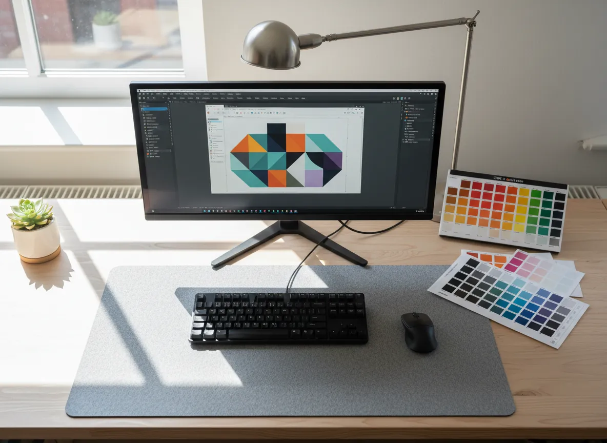
CMYK is a subtractive system. Printing starts with a white sheet and adds cyan, magenta, yellow and black ink. Every drop of ink removes some of the light bouncing back off the paper. Add all four at full strength and you get a muddy near-black, not a brighter colour.
That difference is the whole story. One system makes light. The other takes it away. No amount of tweaking makes them behave identically, and any printer who tells you otherwise is setting you up for a disappointment.
Why the Same File Looks Different on Screen and on Paper
Both systems have a gamut — the total range of colours they can reproduce. The gamuts overlap, but neither contains the other, and RGB’s is significantly wider in the areas people care about most.
The standard screen colour space is sRGB, and it is a properly defined thing rather than a vague setting. The International Color Consortium lists sRGB in its registry of three-component colour encodings with a CRT-based gamut based on ITU-R BT.709-3. It was designed around what a display can do.
Commercial printing has its own equivalent. ISO 12647-2 specifies the process parameters and values for four-colour sheet-fed and web-fed offset printing, which is how a printing condition gets defined precisely enough that two presses in different countries can be expected to match. That standard describes the ink, the substrate and the tone values — a much narrower target than a backlit screen.
So when a file moves from screen to press, colours outside the printable gamut have to be mapped to the nearest reproducible ink mix. Most shift a little. A few shift a lot.
The Colours That Always Disappoint
After thirty years of print jobs, the same handful of colours cause almost all of the surprises:

- Neon and fluorescent anything. Highlighter pink, acid green, electric orange. These live well outside CMYK and will print noticeably flatter.
- Rich, saturated blues. A deep royal blue on screen frequently prints with a purple lean. It is the single most common colour complaint in the trade.
- Vivid greens. Especially the bright, slightly acidic greens that look brilliant on a phone. Cyan and yellow together cannot reach them.
- Pure bright oranges and reds. They print, but usually a shade or two duller and slightly warmer than expected.
If your brand colour sits in one of those groups, it is worth knowing before you order 5,000 leaflets rather than after.
A quick reality check you can do yourself. Open your artwork in software that lets you soft-proof, switch the view to a CMYK profile, and look at the difference. If the change alarms you, that is the conversation to have with your printer before the job runs — not after it.
Rich Black vs 100% K — Get This One Right
This catches out more artwork than gamut ever does. There are two ways to make black in CMYK and they are not interchangeable.
100% K is black ink alone. It is the correct choice for body text, small type and fine detail. It stays crisp, it cannot go out of register, and it does not soak the sheet.
Rich black mixes black ink with some cyan, magenta and yellow underneath to produce a deeper, denser black. It is the right choice for large solid areas — a black background panel, a full-bleed cover, a banner. Printed as 100% K alone, a big black area often looks washed out and slightly grey.
The classic error is a page where the headline is rich black and the body copy is 100% K. On screen both look black. On paper you see two different blacks sitting next to each other, and it looks like a mistake because it is one.
If you are unsure what to specify, tell us what the artwork is for and we will set it correctly. It costs nothing to ask and it is not a question anyone should feel awkward raising.
What to Do Before You Send Artwork
Most colour problems are prevented at the file stage rather than solved at the press. A short checklist:
- Set the document to CMYK from the start where your software allows it. Converting at the end is possible, but designing in RGB and converting late is how people get attached to a colour that was never printable.
- Place CMYK images, not RGB ones. Photos pulled straight from a phone or a stock site are almost always RGB.
- Use one black convention consistently across the document, as above.
- Name your brand colours explicitly in the file — as CMYK values or as a spot colour reference — instead of leaving them as an approximation.
- Export a print-ready PDF with bleed and the fonts embedded. Our guide to print-ready artwork covers what to include, and the file formats guide explains why a PDF beats a JPG for anything with text in it.
One more: if the exact shade genuinely matters — a brand colour, a corporate identity, a product match — say so when you enquire rather than assuming it will be picked up. It changes how the job is set up.
When a Spot Colour Is the Right Answer
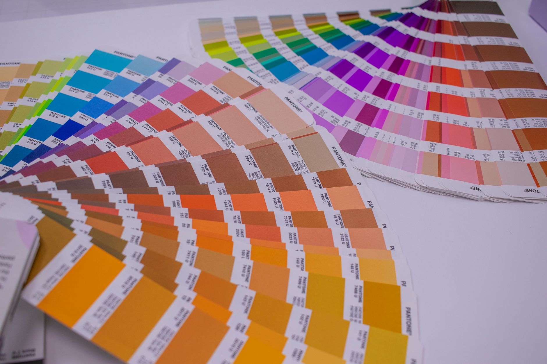
CMYK builds every colour from four inks. A spot colour is a single pre-mixed ink of exactly the shade you want, laid down on its own. Pantone references are the common way of specifying one.
Spot colours solve two problems. First, they reach colours CMYK simply cannot — including the fluorescents and metallics. Second, they are consistent: the same reference produces the same ink every time, on every run, which matters if your logo appears on stationery this month and packaging next year.
The trade-off is cost and process. Spot inks add a plate and a setup, so they suit longer runs and identity-critical work rather than a one-off flyer. For most small business print, a well-set CMYK build is the sensible choice — and a good printer will tell you honestly which side of that line your job falls on.
Large Format and Vinyl Play by Slightly Different Rules
Wide-format printers, vinyl cutters and signage substrates do not behave like a sheet-fed press. Ink sits differently on a PVC banner than on 170gsm silk, and some large-format machines carry extra inks that widen the achievable gamut beyond standard CMYK.
In practice this means colour on signage and banners is often better than people expect, but it is still not screen colour, and the same brand colour can look subtly different across a leaflet, a banner and a vehicle graphic simply because the surfaces differ. Where a set of items needs to look like a set, tell us that at the quoting stage so it can be produced with that in mind.
Colour behaviour also interacts with finish. A matt lamination softens and slightly darkens a colour; a gloss finish lifts contrast and saturation. Our guide to print finishes goes through what each one does to the look of a printed piece.
Frequently Asked Questions
Should I design in RGB or CMYK?
CMYK, if the end product is printed. Set the document up in CMYK before you start so what you see on screen is a closer approximation of the printed result. Design in RGB only if the artwork is purely for screen use.
Why does my printed colour look darker than it did on screen?
Two reasons usually combine. Your screen is emitting light and is probably set brighter than a printed sheet reflecting room light. And any colour outside the CMYK gamut has been mapped to the closest printable equivalent, which almost always means slightly less saturated.
Can you print the exact colour I can see on my monitor?
Not always, and it is fairer to say so upfront. Many colours match closely. Fluorescents, very saturated blues and bright greens do not. Where an exact colour is critical, a spot colour is the reliable route.
What is rich black in printing?
Black ink with cyan, magenta and yellow added underneath to create a denser black. Use it for large solid black areas. Use 100% black ink on its own for text and fine detail, where extra inks would blur the edges.
Do I have to convert my file to CMYK before sending it?
It helps, because then you have seen and approved the converted colours rather than leaving the decision to the conversion. If you cannot convert it, send what you have and tell us — we would rather flag a colour shift before the job runs than surprise you afterwards.
Will the same brand colour match across leaflets, banners and signs?
It will be close, but different materials and different machines produce slight variation. If several items need to sit together and look consistent, mention it when you enquire so the job can be planned as a set.
About the author. Printscene is a print and signage company based in Somercotes, Alfreton, working with businesses across Derbyshire and the East Midlands for over 30 years. This guide is written from the artwork we actually receive and the questions customers actually ask.
Not Sure Your Artwork Will Print the Way You Expect?
Send it over before you commit to a run. We will check the colour setup, flag anything that will shift, and tell you honestly if a spot colour is worth it — get in touch and we will take a look.