
Printscene — Somercotes, Alfreton, Derbyshire
Accessible Signage: Braille, Tactile Lettering and the Equality Act Explained
Under the Equality Act 2010, a fixed sign is not just decoration. It is a “fixture or fitting” — which the Act lists as a physical feature of your premises. That single detail is why signage keeps turning up in accessibility conversations, and why the question business owners ask us most often is the wrong one. It is rarely “do I legally need braille”. It is almost always “will a visitor actually be able to read this”. This guide covers what the law says, what it does not say, and how to specify accessible signage that genuinely works.

Reviewed and signed off by Printscene
- Topic: Accessible signage
- Audience: Building owners and facilities managers
- Read time: 8 min
In short: accessible signage is signage a disabled visitor can find, read and understand — using high contrast, a matte non-reflective finish, clear type, sensible mounting height, and raised tactile lettering with braille where touch is the only way to read it. There is no single UK law that says “every sign must have braille”. The duty is to make reasonable adjustments.
What the law actually says
There is a persistent myth that a specific regulation orders braille onto every door in Britain. There is not. What exists is broader and, in practice, harder to ignore.
The Equality Act 2010 places a duty on service providers and employers to make reasonable adjustments. Section 20 sets out three requirements, and two of them land squarely on signage. The second requirement covers physical features that put a disabled person at a substantial disadvantage — and the Act defines a physical feature as including a fixture or fitting in or on premises. A screwed-to-the-wall door sign is exactly that.
The other half matters more. Where the duty relates to providing information, the Act says reasonable steps include ensuring that information is provided in an accessible format. A sign is information. If the only way to know which door is the accessible WC is to read printed text at distance, then for some visitors that information has not been provided at all.
Note the word doing the work: reasonable. The Act does not hand you a specification. It asks whether you took steps it was reasonable to take. A small independent shop and a 400-bed hospital are not being asked for the same thing.
Where the actual specifications live
Two documents fill the gap between the legal duty and a drawing your sign maker can work from.
Approved Document M is the statutory guidance supporting the Building Regulations in England. Volume 2 covers buildings other than dwellings and is described by the government as providing a baseline for accessibility in the built environment. It was updated with 2024 amendments in October of that year. It applies to building work — new builds, extensions, material alterations — rather than to signs you decide to change on an existing, unaltered building.
BS 8300-2 is the British Standard on designing an accessible and inclusive built environment for buildings. It goes into far more practical detail on signs, symbols, lighting and positioning than the Approved Document does. It is not free — it is a purchased BSI standard — which is one reason so much of the advice floating around online is second-hand and inconsistent.
Neither is a law that fines you for a sign without braille. Both are what a court or an assessor would reach for when asking whether your adjustments were reasonable.
The five things that decide whether a sign is readable
Braille gets the headlines, but it is used by a minority of people with sight loss. Most accessibility gains come from things that cost nothing extra if you specify them at the point of order.
1. Contrast between the text and the panel
This is the single biggest factor and the one most often lost to brand guidelines. Pale grey text on a white panel looks refined on screen and disappears on a wall. Dark text on a light panel, or light text on a dark panel, is what makes a sign legible from across a lobby.
Contrast also matters between the panel and the wall behind it. A white sign on a white wall has an invisible edge, so a visitor with low vision cannot locate it before they can read it.
2. Finish and glare
Gloss acrylic photographs beautifully and performs badly under downlights. A matte or satin finish scatters light instead of bouncing a bright reflection into the reader’s eye. Where a sign sits under strong artificial lighting or opposite a window, finish is not a styling choice.
3. Tactile relief and braille
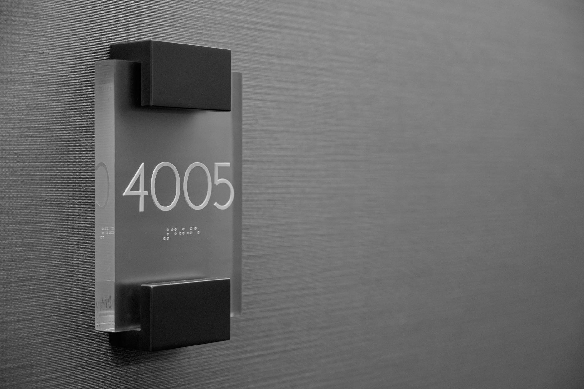
Tactile lettering means characters raised off the panel so they can be read by touch. Braille is a separate system placed alongside, usually below the text. The two do different jobs for different readers, which is why good accessible signage carries both rather than choosing between them.
Raised characters need enough relief to be felt and enough spacing that fingers can track them. Get this specified rather than assumed — a shallow etch that photographs like tactile lettering is not tactile lettering.
4. Mounting height and position
A sign read by touch has to be reachable. The convention is to mount door signs at a consistent height across a building, on the wall on the latch side of the door rather than on the door leaf itself. Signs on the door move when it opens, and a reader feeling for one can end up pushing it away from themselves.
Consistency is doing as much work here as the height. If every meeting room sign is in the same place, a returning visitor learns the building once.
5. Typeface and case
Plain sans-serif type, generous size, and sentence case or initial capitals rather than full uppercase. Words set entirely in capitals lose their shape, and shape is a big part of how partially sighted readers and dyslexic readers recognise a word at speed.

Which signs are worth doing properly
You do not need to retrofit every sign in a building at once. In our experience the highest-value candidates are consistent across almost every site:
- Toilets, including accessible WCs and any changing facilities
- Lifts, stairs and floor level indicators
- Entrances, exits and reception
- Room and department names on a route a visitor takes unaccompanied
- Fire exits and escape routes
The common thread is that all of these are things a visitor must identify on their own, under pressure, often on a first visit. A stockroom door that only staff use is nowhere near as urgent.
Statutory safety signage is a separate matter with its own rules on shape, colour and pictogram, which we cover in our guide to what safety signs your workplace needs. Accessible wayfinding sits alongside those, not instead of them.
Where it usually goes wrong
Here is the view most guides will not give you: the majority of accessible signage failures we see are not missing braille. They are signs that technically carry braille and are still unusable.
The recurring causes are the same handful of things. Braille added under text that is itself too small or too low in contrast, so the sign fails everyone who is not a braille reader. Signs fitted at wildly different heights around one building because they went up as each room was refurbished. Gloss panels under spotlights. And braille positioned behind a door handle or a fire extinguisher bracket, where nobody can reach it.
None of those are expensive mistakes to avoid. All of them are expensive to fix once the panels are made and drilled.
The second common failure is treating accessibility as a bolt-on to a design that was signed off on aesthetics. If the brand palette is two similar mid-tones, the accessible version is not “the same sign with dots on it” — it needs a contrast pairing chosen for the job. That is a conversation to have before artwork is approved, not after.
What to give your sign maker
To get a sensible quote and a sign that works, come with:
- A schedule of the signs — room names or numbers, floor by floor, so nothing is missed and nothing is duplicated
- Your brand colours as actual values, so contrast can be checked rather than eyeballed
- Which signs need tactile and braille, or a note asking us to advise
- Wall construction — plasterboard, brick, glass or timber all change how the sign is fixed
- Any building standard you are working to, for example if a landlord, framework or funder has specified BS 8300-2
We make interior panels in acrylic, aluminium composite and foamed PVC, with tactile and braille options where they are needed. If you are still weighing up materials, our overview of acrylic signs for business covers the finishes and how they behave in real lighting, and our wider guide to interior signs for businesses covers the rest of a typical internal scheme.
Planning an accessible signage scheme?
Send us your room schedule and we will advise on contrast, tactile lettering, braille and mounting for your building.
Frequently asked questions
Is braille signage a legal requirement in the UK?
Not as a blanket rule. There is no UK regulation stating that every sign must carry braille. The Equality Act 2010 requires reasonable adjustments so that disabled people are not put at a substantial disadvantage, and for a building open to the public, braille and tactile signage on key doors is very often a reasonable adjustment. New building work in England is separately assessed against Approved Document M.
What is the difference between tactile and braille signage?
Tactile signage has the printed characters themselves raised off the panel, so they can be read by touch by anyone. Braille is a separate dot code, normally placed below the text, read by people trained in it. Braille readers are a minority of people with sight loss, so a good sign carries raised characters and braille rather than only one of the two.
Where should a braille sign be fixed?
On the wall to the latch side of the door rather than on the door itself, at a height that can be reached comfortably, and at the same height on every equivalent door in the building. Consistency across a site matters as much as the exact measurement, because it lets a visitor learn the pattern once. Keep the panel clear of handles, brackets and anything else fixed to the wall.
Do accessible signs have to be a particular colour?
No specific colours are mandated. What matters is contrast — between the characters and the panel, and between the panel and the wall behind it. That gives you a lot of freedom to stay on brand, provided the pairing you choose is genuinely high contrast rather than two shades of the same tone.
Does an existing building have to be brought up to Approved Document M?
Approved Document M is tied to building work such as new builds, extensions and material alterations, so replacing signage in an unaltered building does not by itself trigger it. Your ongoing duty under the Equality Act applies regardless of whether any building work is happening.